As the only designer on a lean product team within Amazon Talent Acquisition, I led the end-to-end UX and UI design for Prelude, an internal scheduling tool purpose-built for recruiters overwhelmed by inefficient, fragmented workflows. Starting from zero, I shaped the product from concept to solution, focusing on low friction interactions, and seamless calendar integration.
Back in June of 2020, the pandemic was in full swing and I had just started at Amazon. I joined a small but growing product team as it’s only designer. Its purpose was to help recruiters by eliminating pain points and paper cut tasks. As hiring demands skyrocketed and recruiting ramped up, our team’s mission rose in prominence.
By the time I started, a recruiter journey map had been produced. It contained a list of the typical tasks and software a recruiter interacted with on a daily basis. The document showed how fragmented the day-to-day was for a recruiter as they constantly switched between various platforms and software products. The daily task of reaching out to candidates and coordinating with them for phone screens or preliminary calls was a giant time suck. Recruiters often called this “scheduling tennis” as the back-and-forth of messaging a prospective candidate just to get them on the phone could take upwards of 5 hours. Scheduling was an obvious vector for optimization and our team decided to tackle it.
Our team was very pragmatic; if a third-party solution existed, we’d put our efforts toward adopting and helping train recruiters to use it. For scheduling, something like Calendly could have been an easy win (although at the time Calendly was very young) but it wasn’t a good fit. Product limitations and strict information security ruled out most third-party tools. One such tool called Time Trade was being piloted but it had major feature gaps. We would have to build our own product.
Designing and building an in-house scheduling product had some encouraging advantages:
- As a team placed within Talent Acquisition, we had direct access to our customers - recruiters. We could instantly reach out for feedback and tailor the product to their needs and work.
- As part of AWS, we had access to a broad range of computing products and scale.
I often told prospective team members that we were building fireworks at a rocket factory. - We had access to internal tooling, which in turn lead to some great automations. Onboarding was a two step process with things like automatic profile population and calendar integration.
- Rigorous accessibility and security audits were conducted to ensure our software passed the high bar required by Amazon.
With access to our core customers and the technologies needed, we got to work.
As mentioned before, recruiters were often overburdened by having to constantly switch between different software and platforms, so introducing yet another software product was ironic. We were mindful of not adding another friction point in a recruiter’s day-to-day and ensured they could derive a lot of value out of Prelude while interacting with it as little possible - a set it and forget it mentality.
The premise of Prelude was simple: you set up your meeting preferences and are given a link. The link is yours to share with whomever you want to meet. Accessing the link takes its recipient to a booking page where they choose their preferred date and time to meet with you.
The Prelude link’s portability and re-usability was what made the product useful to recruiters. They could share it in many ways: within email signatures, LinkedIn messages, and message boards; basically any communication vector they used to find candidates. As long as link could be shared, Prelude was useful.
Prelude also had direct access to a user’s calendar and availability - it automatically surfaced the available times for candidates and never caused double-bookings on the recruiter’s calendar.
Additional settings like buffers to prevent back-to-back meetings, daily and weekly booking limits, and an availability window to ensure meetings could be booked within a certain time frame (from two weeks out to as far as an entire quarter out) were given to recruiters to ensure they could control their schedules. Once a recruiter set their desired time range, Prelude would do the leg work and serve candidates a recruiter’s available times.
Until the recruiter needed to modify the details of their meeting, or create another meeting type, there was little to no need to revisit the Prelude web app.
Prelude's homepage

The Link UI

The Availability & Meetings Section
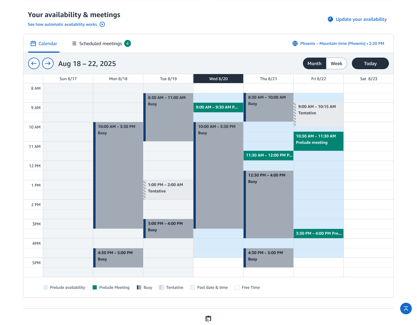
Early on when we were designing the UI/UX for Prelude, we came across an interesting problem. We chose to implement a calendar on the homepage to display a user’s Prelude availability (the times Prelude meetings could be booked). The calendar would also display existing calendar events and Prelude booked meetings. A user could see when Prelude meetings could be booked, and how that would fit into their schedule. However, this calendar created two problems:
- With the calendar being high fidelity, some users assumed that it functioned like their Outlook calendar. As a 1:1 recreation, why couldn’t users create/edit meetings in addition to accessing detailed views? If we catered to this assumption, we would be taking on a large engineering and design burden by adding additional redundant functionality that wasn’t inline with the app’s core mission. In short, Prelude was not meant to be another meeting management application, but based off appearances, one could reasonably assume it was.
- Pulling in all the user’s calendar information required a lot of API calls. The requests per minute (RPM) were too high, leading to potential rate limiting.
After discussing the issues, an engineer on our team proposed a solution, we could request a much simpler data set: free, busy, and tentative times. We’d render these in the calendar, so the user could see simple busy and tentative time blocks (multiple back-to-back meetings would be rendered as one block). These blocks would exist alongside Prelude availability ranges, and the meetings generated by Prelude.
This solved both the RPM and high fidelity issues. Users saw generic busy blocks and rightly assumed they couldn’t edit or create events. This approach helped streamline the calendar and reinforced its intended purpose.
As time went on, we tackled more problems revolving around the same issue: how much functionality was appropriate? What was enough, what was too little? At what point would Prelude’s core purpose and functionality be diluted? Striving to find that balance was always a fun challenge.
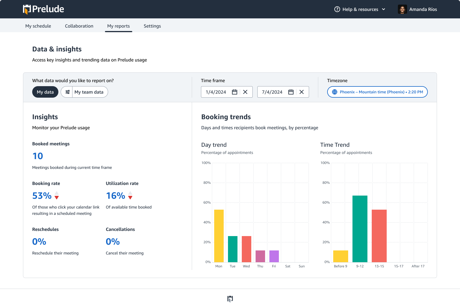
Soon after launching the Prelude beta, we began work on the reporting feature. The goal was simple: give users actionable metrics to monitor their Prelude usage, meeting performance, and availability utilization. Reporting gave users a clear picture of how their Prelude links were performing in the real world and helped them make adjustments as needed.
Reporting wasn’t just for individual contributors. Managers and directors could access team and org-level reports to view a robust set of metrics showing Prelude’s performance over time. Larger datasets and extended timeframes helped highlight trends and longer-term patterns.
As with Prelude’s core functionality, we were intentional about what data to surface. We focused on making every metric useful, actionable, and aligned with our customers’ needs.
With Prelude's core functionality completed we continued iterating and optimizing wherever needed. Once such instance revolved around the lifecycle of Prelude meetings, and identifying functional gaps that needed to be addressed. Once a Prelude meeting showed up on a calendar, it was outside our purview. For recruiters, Prelude meetings automatically showed up on their Outlook calendar, whereas candidates had to download the meeting ICS or accept the meeting invitation sent to their inbox (and calendar application of choice).
Recruiters and candidates could reschedule or cancel meetings, but unless it was done via Prelude flows, the application wouldn’t know of the new status. Having to cancel or reschedule the meeting within Prelude was an obvious point of friction. We decided If a recruiter or candidate directly manipulated a Prelude meeting on their calendar we needed a way for Prelude to respond.

Our solution was to create a middle man of sorts, an event listener that would be aware of a meeting status change and send that information over to Prelude to then act. If a recruiter or candidate were to delete the meeting off their calendar, Prelude would be aware and ensure the cancellation occurred for both parties. Reschedules were a bit more complex.
Prelude’s approach to rescheduling was different: candidates (or more generically link recipients) would always get first dibs. If a recruiter wanted to reschedule a meeting at a specific time, it was still up to the candidate to choose. This approach of “the candidate always get the choice” was a very Amazonian customer-obsessed mentality. However, this meant reschedules were more difficult to realize outside of Prelude. With reschedules we ended up with two approaches, one for recruiters and the other for candidates.
For recruiters moving a Prelude meeting to a new time slot would snap it back to its original time and set off the request reschedule flow. The recruiter would be notified of the request for the candidate to reschedule. The candidate then receives an email and follows the link to their booking page to reschedule.
For candidates moving a Prelude meeting to a new time slot, one of two things would happen. Once the meeting landed on the new time, Prelude would check to see if that time matched the recruiters availability. If so, the meeting was automatically rescheduled and both parties would be informed of the change.
If the recruiter did not have matching availability, then Prelude would kick off the reschedule flow. The candidate would be informed that the new time would not work for the recruiter, if they followed the reschedule link they’d be able to pick a new time.
This approach of listening for events and then kicking off work flows turned out to be a quiet win. For candidates who would select a new time within their calendar, it often correlated with their recruiter’s availability, thus giving users a "it just works" experience. For those unlucky few who had to reschedule via their Prelude booking page the application still responded to their action and gave them means to complete it.
At a minimum, meeting events that occurred outside of Prelude could be acted upon ensuring the meeting stayed in sync for both parties. Prelude gave users control of their meetings outside of the application, reducing friction and saving time.
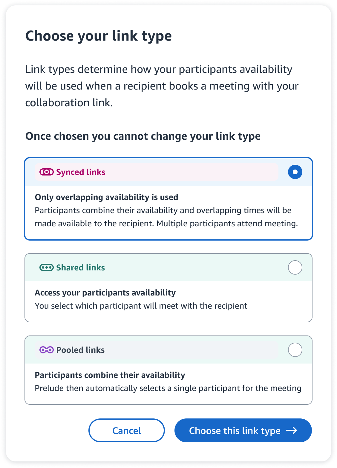
As Prelude usage skyrocketed, we began getting requests for new types of links. Up until this point, all Prelude meetings were conducted between 1 recruiter and 1 candidate, we (and our customers) wanted to expand out and offer more meeting types. What we ended up with was collaboration links. Collaboration links could be used in many ways. Their main use case revolved around having a team with which to share the scheduling burden. The different link types adapted to scheduling scenarios; we came up with three:

Synced links
Synced links combined the availability of 2+ Amazonians with a single recipient. Only the overlapping availability of the Amazonians added to the link (with attendance required) would be made available for scheduling. Synced links could be used for meet-the-team calls, office hours, or even a sales pitch that required multiple roles.

Shared links
Shared links allowed you to set standardized meeting settings for participant(s), access their Prelude calendar availability, select which participant will meet with the recipient, and share a link to schedule on their behalf. Shared links were great for Recruiting Coordinators, Managers or any Admin that wanted to pair a specific recruiter with a candidate.

Pooled links
Pooled links allowed you to create a link with the combined availability of 2+ participants, maximizing the available meeting times offered to recipients. Once a recipient picked their meeting time, Prelude would then find the corresponding participant to pair with the recipient (round robin rules were used to distribute the load). Pooled links were great for Recruiting Sourcers or top of the funnel Sales Reps.
Collaboration links turned out to be a roaring success, beloved by our customers and expanding the potential use cases for Prelude. What began as a recruiting tool now had utility for all of Amazon.

As the job market changed post pandemic, so did our primary user base. Recruiting gave way to sales. As we adjusted the feature set to work with both roles, we began looking to the future and leveraging new and upcoming technologies.
Our team rolled out an API to integrate Prelude links into third-party applications like Salesforce, cementing Prelude as part of their customer acquisition workflow. One of the new endeavors was using generative AI to assist users in writing to their respective candidates/customers.
Using templates and multiple meeting links, we began looking into creating pre-built Prelude instances for new employees. On day one they’d have a set of standardized meeting links readily configured to book meetings with fellow co-workers and customers. We also wanted to create configurable workflows so bearing the success of an initial call, the customer/candidate would then be prompted to schedule a follow-up meeting quickly without having to re-fill out contact information.
By combining these workflows and templated Prelude meetings with AI that automatically captures meeting notes, summarizes key points, and suggests the next meeting type, Prelude could evolve into a proactive assistant that streamlines scheduling, improves continuity between meetings, and reduces the administrative overhead of working with candidates or prospective customers.
In addition to copious anecdotal praise, Prelude’s usage has been a huge success. Prelude launched in April 2021 and as of February 2024, more than 30 thousand Amazonians became Prelude users, scheduling over 2 million meetings. Since launch, the estimated economic impact is the elimination of 40 million in labor cost (assuming a labor cost savings of $15 per meeting booked, a conservative estimate considering how much time booking a meeting with a candidate or customer can take).
Here are some of my favorite customer quotes:
Looks really good. The interface is also quite easy to set up.
The tool is super awesome! Thanks for developing it! Customers love it. Some don't even ask any more in email first, just book an appointment :) I absolutely love the feature 'show tentative as busy/blocked'. Keep up the great work!
I’m a very big fan of Prelude, it saves so much time and it has increased my productivity. I use it a lot and evangelise it to anyone who is willing to listen! Additionally, everyone who uses it externally is always complimentary of the tool as it saves them time as well.
Prelude is a great tool for me and my team. We send our prelude calendar link to sellers to allow them to book meetings with us. it saves so much time by not needing to individually provide seller our availability. Prelude is amazing.
This is exciting! I’m in awe of all they [Prelude Team] have done.


.png)


